Scrollbar marker colours on macOS
Posted 25th January 2021 in Accessibility and CSS
The other day, a colleague of mine asked why I didn’t have scrollbars on my website (thanks for the heads-up, Sam!). I was confused: there were scrollbars, weren’t there?
I’ve been using Dark Mode since it landed in macOS Mojave back in 2018, where the scrollbars have been showing fine. Turns out I hadn’t noticed that in Light Mode they were barely visible, and, as the default scrollbars are an operating-system wide feature, this was across all browsers on macOS! Quite the accessibility faux pas!
The problem
You know that satisfying bounce when you scroll up or down and hit the top or bottom of the page? It happens in Safari and Chrome (and Chrome-alike browsers like Opera and Edge), so I added a colourful background behind the main page canvas, to match my brand. Something along these lines:
html {
  background-color: blue;
}

.canvas {
  background-color: white;
}

@media screen and (prefers-color-scheme: dark) {

  .canvas {
    background-color: black,
  }
}
macOS chooses either a light or a dark scroll marker, but I had made the mistake of assuming the colour of the marker was based on the main background colour. Naïvely, I didn’t think it would make a difference which element the colour was added to.
Things looked fine in Dark Mode because the scroll markers were being chosen based on the blue I was using, which is considered ‘dark’: the markers were light, for the best contrast. This was fine against the dark grey background of the canvas, but in Light Mode, the markers remained light, producing exactly zero contrast against the white background!
It turns out that the scroll marker colour is chosen based on the background-color of the <html> (or <body>) element; any background colours set after that, like on my .canvas element, aren’t taken into account.
The solution
The solution was to use two background blues, just as I’d used different colours for the canvas: one for Light Mode and another for Dark Mode.
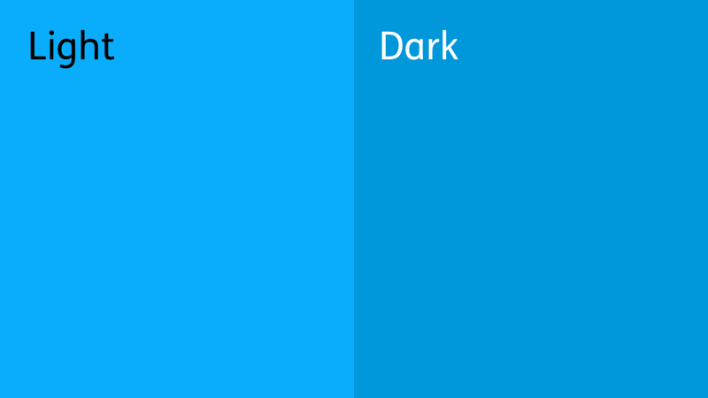
The lighter blue (#09adfc) is considered a ‘light’ colour, so a dark scroll marker is produced, contrasting nicely with the white canvas that overlays it.
I then nested the Dark Mode background-color in prefers-color-scheme: dark media queries so that the the light markers the browser uses were still visible against the dark grey background.
html {
  background-color: lightBlue;
}

@media screen and (prefers-color-scheme: dark) {

  html,
  body {
    background-color: darkBlue;
  }
}

.canvas {
  background-color: white;
}

@media screen and (prefers-color-scheme: dark) {

  .canvas {
    background-color: black,
  }
}
So the lesson is: if you’ve got a colour behind your page to add that wee bit of scrolling pizazz, make sure it’s in the same category (light or dark) as that of your main page canvas or you risk badly contrasting scroll markers!