Designing a cohesive suite of applications
When I started work at EvaluAgent in early 2017, the whole team was working full tilt on the backend rebuild of their products, a suite of applications to measure, report and encourage good quality customer services in contact centres. What they didn’t have was an interface!
Like many products’ version 1, the existing user interface (UI) was densely packed; as the product grew and features were added, they had been built into the existing design and it was quickly becoming unusable. But there was another problem: each of the existing apps looked different. Some looked like Bootstrap version 3, other were completely custom designed; there was very little that told the users that these apps were app provided by the same company.
The goal was to redesign the interfaces to be more usable, and the user journeys to present the right actions and information at the right time. On top of that, consistency was needed to tie the apps together, while ensuring each was recognisable at a glance.
Here are some examples of the products EvaluAgent provided to their clients, though there were a handful more:
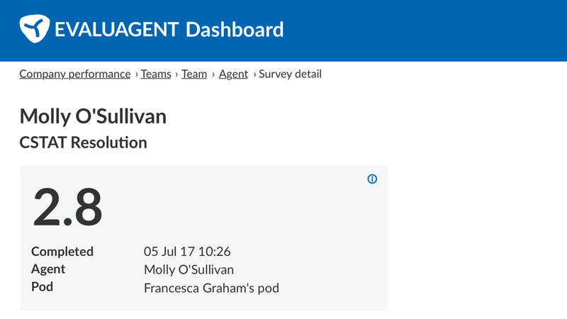
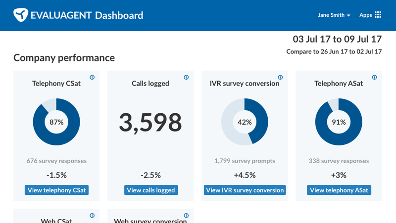
- Dashboard overview, where managers access dashboard overviews of CSat, number of calls, survey conversion rates, and so on, viewed at multiple levels: company, teams or even individual agents.
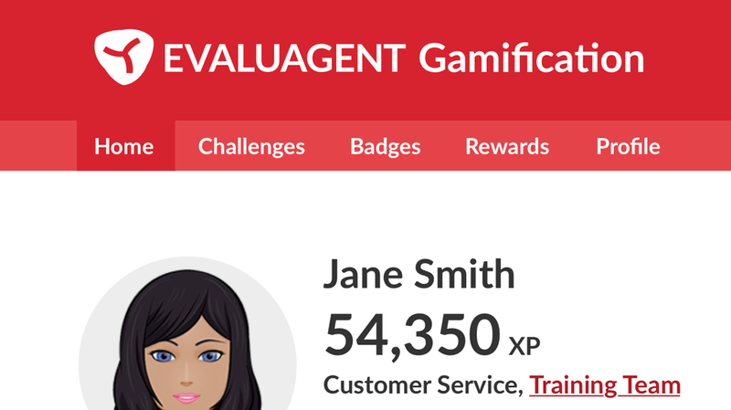
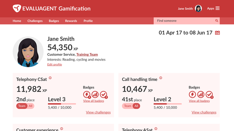
- Gamification, where managers could configure challenges where the agents (or teams of agents) would compete against one another to achieve a certain goal, such as lowering average call handling time or increasing customer satisfaction (CSat) scores; the winners achieving badges and more tangible rewards
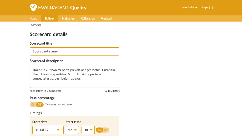
- Quality monitoring, where a call handling agent’s performance is recorded using a pre-configured ‘scorecard’, as well as the ‘builder’, where the scorecards are configured and published before being used to evaluate agents’ performance
Creating cohesion
The first thing to do was to create a unified look and feel that would carry through all the applications.
One central pattern library
A pattern library was a clear place to begin to ensure all interface elements had a common root. The library covered:
- base styles from headings and other typographical elements to form components like inputs, checkboxes, radios and buttons
- more bespoke components like cards, charts and graphs
- combinations of those components
- whole-page previews
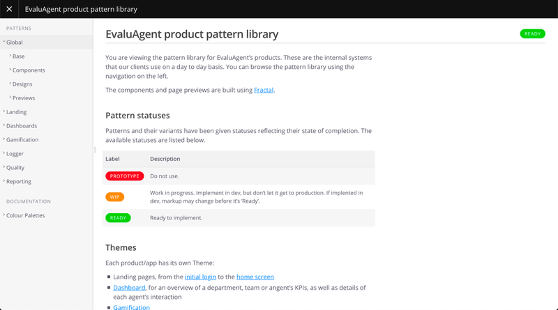
A design system was built around the pattern library, but that’s another case study for another day!
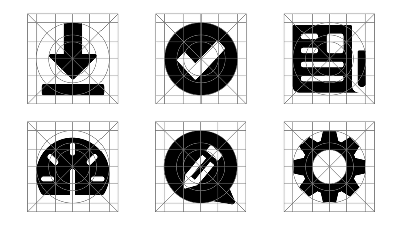
Icons
Typography, type scales, etc. are straightforward to control with CSS, but when it comes to more illustrative page elements, care should be taken to ensure consistency.
For our v2.0 releases, a handful of interface icons were needed, so instead of using a 3rd party library, it made sense to design a small bespoke icon set to cover use cases like date pickers, filters, information, search, etc. All icons used the same overall style and tone, a common canvas size, and stroke widths were equal. App icons and Gamification badges were more detailed, so a grid was used for those.
Common language
Design is not just about how interface elements look and are presented, it’s also about the language used. It was important with this redesign to reconsider all of the previous words that had been used to refer to various parts of the product, and to ensure that any new pages introduced were referred to in the same way throughout the app and by users themselves.
In order to do this, I was able to gain insight from users via the EvaluAgent client managers.
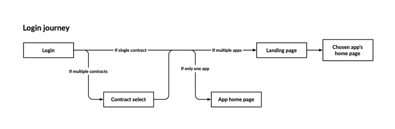
A good example of this is the concept of ‘home’. Each app would have a ‘home screen’ that the user can return to via the in-app menu in the header.
This would be distinct from the first page the user sees when first logging in, which was referred to as the product’s ‘landing page’, where they choose which app to navigate to.
An example of where I had planned to make changes were with the name ‘Gamification’. This is how the product team might refer to it internally; it may even be how clients understood it, but it wouldn’t mean much to the end user. I had planned to conduct some research to establish how users would think of this app.
Getting around
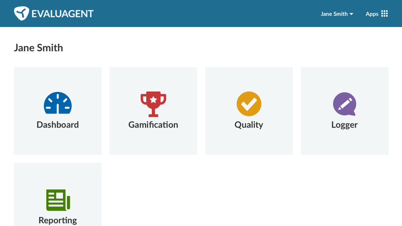
Reaching the app would be straightforward when the user first logs in – they are presented with their landing page, and select the app they wish to open. But what happens if a user is already in an app? For that, there’s an app switcher item in every page header, which was influenced by Google’s app switcher:
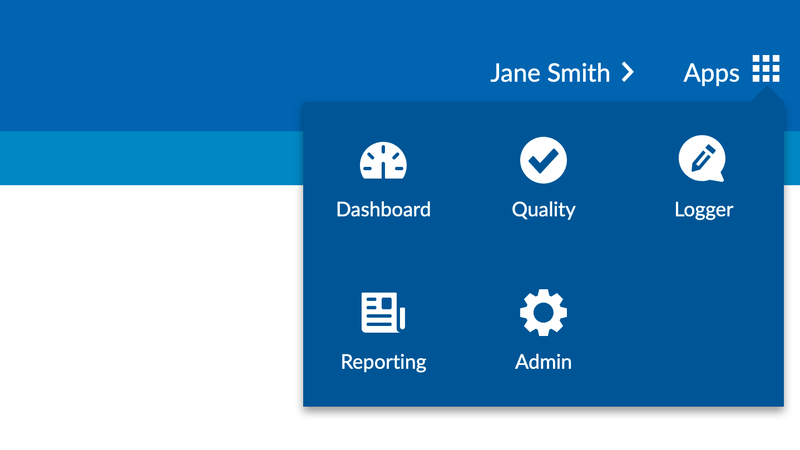
It’s possible that a user had one app, in which case the app switcher would be removed from the header, and they would also bypass the landing page and see their app’s home screen on log in.
Within each app, the navigation bar in the header, which you have seen in the Gamification ‘Home’ example above, is how the user would reach each ‘section’ of the app (Challenges, Badges, Rewards, Profile and return Home in Gamification).
However, there was a strong user need for a sense of place within each app; users were often getting lost, having to return to the home screen and start again to find their place. I employed breadcrumbs to inform the user how far they’d ‘drilled down’ into a particular section, but also give them a method of navigating back ‘up’ to a ‘higher’ level.
Distinguishing each app
Now that we had consistency of interface, language and navigation, I had to think how best to differentiate one app from another. Aside from the name of the app being in the top-left corner of the header, and the interface of each app consisting of different content, colour felt like the most effective way to make a distinction.
So each app was centred around a single colour, taking inspiration from other suites of apps like Microsoft Office (Blue for Word, Green for Excel, etc.). Light and dark variants on that colour were needed to communicate meaning in different ways, as well as blacks, whites and greys.
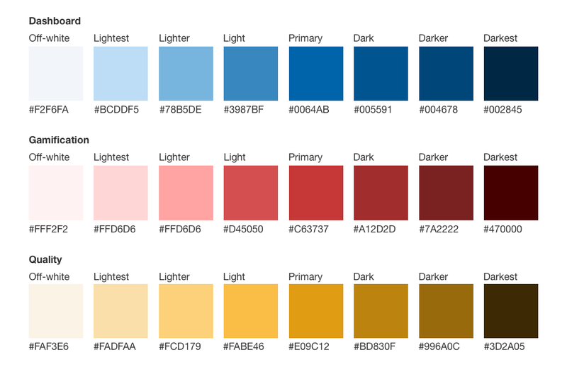
There are a limited number of distinct colours to choose from, which would mean as the suite expanded a basic set of blue, green, red, yellow, etc. would need to diversify into turquoise, orange, purple, and so on. I was satisfied this wouldn’t be an issue, as, even if two colours were similar, it wasn’t solely colour that was differentiating the apps.
The Dashboard app, for example, would consist of a series of ‘cards’ containing graphs and statistics.
Gamification was to be more visually engaging, with cartoon avatars to represent the agent, and larger cards containing badges.
Quality was arguably the driest of the apps in this example, consisting mainly of forms as the user either built or filled out a scorecard.
A solid version 2
The designs I produced were infinitely more usable than the messy, often inaccessible interfaces of the version 1 product. Users found it easier to carry out the tasks they needed to, saving time and frustration as well as increasing EvaluAgent’s value to the client.
There was also a nice knock-on effect where the consistent, professional and unique (no more Bootstrap!) look and feel made it easier for sales and marketing to present the product in all its variations to potential clients.