The Web Content Accessibility Guidelines (WCAG) are held up as The Way. Meet WCAG, ensure you continue to meet WCAG, and you’re in good shape. While it’s true that WCAG represents a solid baseline, there’s a lot more we can and should be doing to make our work accessible to as many people as possible.
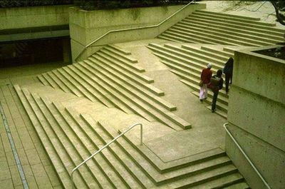
if the slope of the “ramp” is less than 1:20(5%), it is not technically a “ramp” and handrails, landings, edge protection are not required.
The suggestion is that the architect knew that they could avoid using handrails if they ensured the slope of the ramp didn’t exceed a certain angle. So the stairs are compliant design, but not accessible design.
Three ways we can do better than WCAG
Complying with WCAG is great, but only just meeting a threshold, or taking advantage of an exception or loophole is very much not in the spirit of accessibility. Here are three good examples of things WCAG doesn’t cover:
Icon-only buttons
WCAG allows icon-only buttons. As long as they have accessible non-visible text, that’s considered sufficient. But I think we can do better.
Aren’t those icons pretty cryptic sometimes? Some icons are very widely used, but others might need a little more imagination. I’m not sure that’s fair on all users.
And then there’s people who use speech recognition software, who often have to guess the correct word to activate an icon-only button. There are work-arounds, like “Show numbers”, which labels all interactive elements with a number that can then be ‘clicked’, but is that the best experience we can give our users?
Disabled buttons
WCAG says that disabled buttons don’t have to meet the required levels of contrast, in order to be more easily discernable by users with visual impairments:
The visual presentation of text and images of text has a contrast ratio of at least 4.5:1, except for … Text or images of text that are part of an inactive user interface component
So is it okay to leave some visually impaired users wondering what that difficult-to-make-out button says? Or unsure if there’s a button at all? Especially when it’s a pretty simple matter to avoid disabled buttons altogether.
I don’t imagine users with a vestibular disorder or photosensitive epilepsy, who could experience nausea, migraine, or even seizure, would appreciate having to frantically look for a pause button to stop the animation. And if there’s no button and it stops within five seconds, there’s no guarantee that something unpleasant (or dangerous…) hasn’t already been triggered.
Meeting WCAG isn’t enough
Just because we’re WCAG 2.1 AA compliant doesn’t mean there’s not more we can do to make our sites actually accessible.
Regarding just scraping in as ‘job done’ is not enough. Accessibility is not a checklist, and AA compliance is just the start. Just because something is compliant doesn’t mean it’s accessible!
Accessibility in your inbox
I send an accessibility-centric newsletter on the last day of every month, containing:
A roundup of the articles I’ve posted
A hot pick from my archives
Some interesting posts from around the web
I don’t collect any data on when, where or if people open the emails I send them. Your email will only be used to send you newsletters and will never be passed on. You can unsubscribe at any time.
More posts
Here are a couple more posts for you to enjoy.
If that’s not enough, have a look at the full list.