Apple Watch’s default app view is bad
This Christmas, both my mum and brother counted Apple Watches amongst their presents (!) and, as the family Apple aficionado, they asked me to show them how to use their new gadgets.
My mum enjoyed exploring the faces, while my brother’s mind was blown at how nicely the sports strap secures itself to your wrist. Happy recipients. But the one thing that gave them both some trouble was the app view screen, accessed by pressing the Digital Crown.
The default view is the ‘Grid view’, and I’ll admit the honeycomb arrangement of the circular app icons is pretty to look at, but my mum hadn’t the slightest idea what to do with all of those wee circles. My brother faired better, understanding that they were apps to choose from, but he had trouble identifying some, like the Stopwatch and Timer apps, whose icons are almost identical.
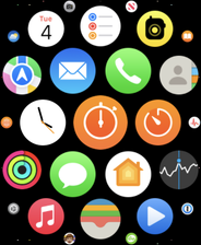
It’s the only place on watchOS that uses this cluster-style design for a collection of items. Everywhere else, a vertically scrolling list is employed, that you can navigate with either your finger or the Digital Crown. Consistent and sensible.
Thankfully, you can change the Grid View to something more in keeping with the rest of the operating system; something I had done a long time ago, which is why I’d forgotten what the default was. Just long press anywhere on the app view screen to trigger ‘View Options’:
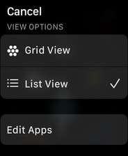
Note: you can also do this in Settings → App View or, if you prefer to use your phone, the Watch app → App View.
Selecting the ‘List View’ option makes things much more usable, presenting the icons in alphabetical order with the app icon to the left of a text label:
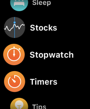
In List View, ambiguous or difficult to identify app icons are a non-issue since you can use the visible text label. It’s also clear what’s going on. By all means, Apple, keep Grid View for people who enjoy a bit of a guessing game, but why List View isn’t the default is beyond me.