The simplest solutions are usually the best
I spent over five years happily tinkering with my brand, trying to find a way to tie in a stand-alone icon that I was happy. Now five years is a long time, but this story starts before that, with my original brand.
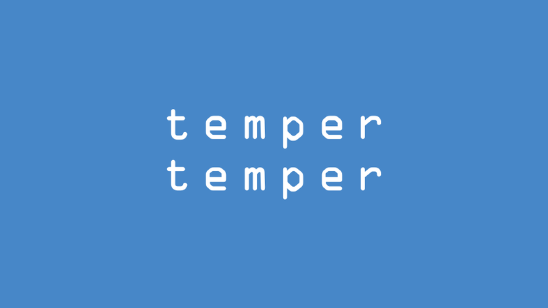
My original branding was ok… I used the friendly-looking Museo Sans as my main typeface and my logo used OCR-A, a retro monospace font, set white on a smokey blue background with the words ‘temper’ and ‘temper’ stacked on top of one another.
It served me well for the first few years, but it was always something I was looking to overhaul. I set five rules for a re-brand:
- I had always written ‘tempertemper’ as one word, so the logo should follow this – no separation
- The logo should include some kind of icon or motif that I could use separately
- It should work well against a white background, which my original logo never really did
- It should convert well to work against a dark/black background, which my original logo definitely never did
- Without losing friendliness, the typefaces should feel more classic; less cartoony
My re-brand work started with the logo, with the notion that the typeface and general colour palette would stem from there.
A first stab
I’ve always been a fan of Helvetica Neue in a bold weight, so a lot of early concepts involved that.
It was progress, but it only fully satisfied the first rule:
- It was presented as one word
- There was no motif/icon
- As the bold letterforms were more distinct, it worked better than the original logo against a white background, but it wasn’t great; changing it to black was better but it lost character
- Similarly, it worked ok on a black background; again, it was better in white, but felt a bit lifeless
- Although beautiful, Helvetica Neue can feel a bit aloof – classy but far from approachable
Furthermore, the way the r of the first temper met the t of the second (the ear of the r is thicker than the crossbar of the t) didn’t sit right with me; this was especially true of black text on a white background. Also, Helvetica Neue’s lowercase a and uppercase R are incredibly elegant, so a logo without them felt like a missed opportunity!
Bringing in the big guns
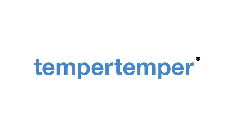
So in the summer of 2014 I called in my good friend Ant Barker, who I’ve collaborated with on countless client projects. He built upon the work I’d been doing and came up with something we were both very happy with!

- It was presented as one word
- An underscore, which represents a cursor, tying it into both coding and writing
- The black text works well against a white background and the (newly brightened) blue in the underscore provided a touch of vibrancy/fun
- It was easily switched to white text to accommodate a dark background
- The typeface (FS-Me) draws inspiration from Helvetica, so feels classic, but has a much more approachable feel:
- There are no sharp edges to the letterforms
- The softened corners on that previously-troublesome first
rand secondtmean they flow into one another well, despite having different thicknesses - The upward curves of the terminals on the
tgive it a wee bit of extra energy - The
es are especially friendly-looking What’s more, FS-Me was designed with accessibility in mind which very much appeals to me
An iteration
In the five and a half years since that branding work my business has changed a lot! And the branding was flexible enough to allow for that, but one thing has been bugging me all those years: there wasn’t a true icon.
The square canvas version of the logo used the two ts and the underscore, which looked smart enough, but:
- Letter-based icons feel too easy! I wanted a single shape/mark
- It wasn’t all that distinguishable at very small sizes
- It drew attention to the
ts as initial letters of two separate words; something I’d be looking to avoid - Some people think of cars when they see two
ts
Working on a new icon
The iteration of my logo started with the idea that I needed a more illustrative, stand-alone icon.
I started with blue fire icon, which was a (tenuous) reference to tempering steel, where metal is heated up then rapidly cooled down in order to increase its durability and efficiency. The fire icon went through revision after revision as I wanted to like it, but it wasn’t right.
The more icons I tried—a rocket ship (too start-upy), a star (too audacious), a lightening bolt (too flashy), a broadcast symbol (too RSS)—the more I felt simpler was the way to go.
I spent hours looking through the thousands of Unicode characters for some kind of punctuation. An asterisk looked nice but could suggest there might be some small print – not questions I wanted to raise in people’s minds. Curly braces ({}) had the right tone but have been done to death. Square brackets? A caret (^)? A triangle? Square? Circle? An arrow? Nah.
One day, on the bus home from work, I scrolled to a blog post by Amy Hupe in my Twitter timeline that used a great big square full-stop as its icon, and it hit me: the underscore was right all along! All it needed was some tweaking and it could be used as a stand-alone icon in its own right.
An iteration
Here’s where I landed with the new design:
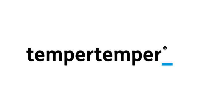
Don’t see much difference? Well, there’s not! But if you look closely:
- The underscore is thicker, to match the widths of ascenders (vertical lines) in the letters of the logotype, making it more prominent at smaller sizes
- It now has square corners, making it a perfect rectangle and well and truly checking the ‘simplicity’ box
- I gave it a simple 4 × 1 aspect ratio, which felt like the right proportions; it also fits nicely into an 8x8 square canvas
Here’s a closer look at the new underscore, in comparison with its older shape:
How’s that icon looking?
So the change to the logo is pretty low-key. The biggest change is how that translates to an icon. So instead of the tt_ icon, you’ll be seeing something else:

So it’s a simple and very flexible icon; what’s more:
- It’s a single shape/mark
- It looks great at very small sizes
- It doesn’t suggest tempertemper is two words
- It doesn’t help Audi’s marketing department
The verdict
As I had been doing with all of my ideas, I ran it past Ant for a more objective out point of view:
Its a subtle improvement to something that I always thought looked great. So it’s a yes from me!
So it turned out, as with most things design, the simplest solution was the best.