A minimal task list pattern for GOV.UK
I’m a big proponent of minimalism, and in the years I’ve been working on digital services in Government, I’ve often come across over-designed and over-engineered solutions.
One particular design pattern I have helped shape has been the Task List.
The service I’ve been working on for the last couple of years is big. There was a strong user need for the mountain of information that was required to be broken down into more manageable sections, so we use the task list pattern as the central ‘hub’ of the service.
Once the user has submitted their application, they are required to keep it up to date, so they user the hub page to manage their business’s information.
But this isn’t a story about how I use a pattern, it’s about how I contributed to the HMRC Design Patterns.
The task list pattern
When I first started work on the service, the hub page was causing problems. I’m laying no blame here at all as it pre-dated the now more established GOV.UK Design System’s Task List pattern.
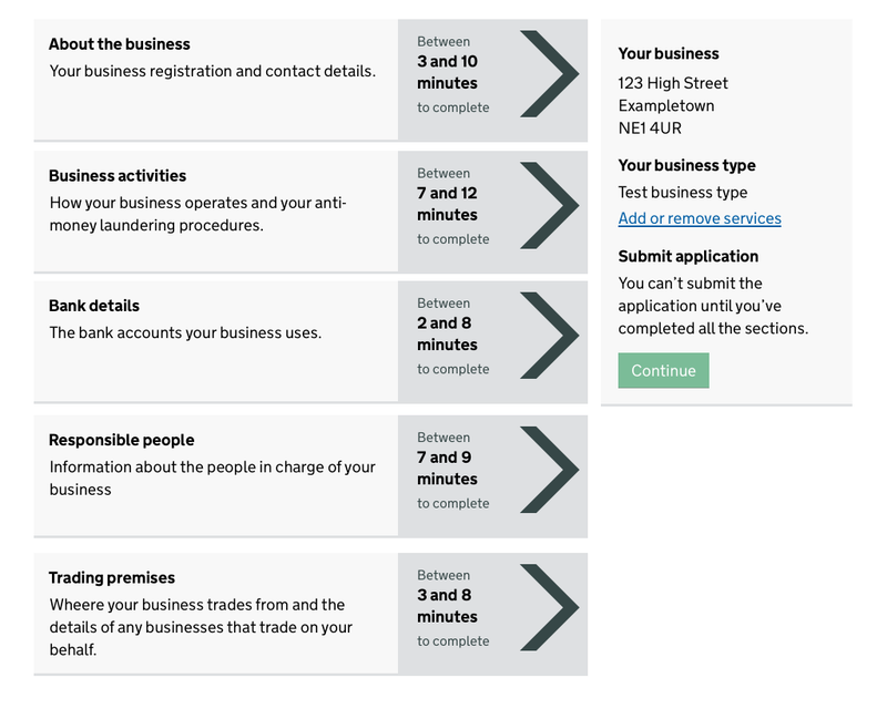
It’s worth mentioning that the task list works in conjunction with the ‘Submit application’ section of the page, which provides the path forward, once all the business information sections have been completed.
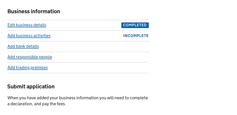
Anyway, as I said, users of our service were having a lot of issues with this page and it was clear it required some redesign work. So, with the GOV.UK Design System Task List pattern available and being widely used and tested, I started there, but quickly ran into a problem: the task list pattern only accommodated two states, but our service had multiple.
We needed an incomplete state, so immediately I was deviating from the prescribed pattern. So we set to testing how this pattern could be adjusted to accommodate non-binary states.
Our first iteration was to reverse the off-the-peg pattern’s colours for a third state to make it more visually identifiable.
We found a few issues here:
- The blue text on a white background led users to believe they could click it, as it was the same color as a link
- The white text on a blue background looked like a button to some users, who tried to click it
- Users weren’t clear with what to do when the line was blank
So we iterated by changing the colours to a more subdued and not-clickable-looking black and adding a more explicit ‘Not started’ status.
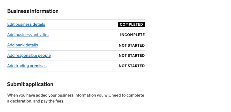
After testing with both blank and the ‘not started’ tags, we were reassured that users found the ‘not started’ tag easier to use. We also observed no attempts to click the status tags. Success! Or was it…
The content designer an I were uncomfortable with the readability/accessibility of the all-caps used for the status tags, when they were used frequently, in the context of a task list like this.
We were also struggling with the rationale behind the heirarchy that was introduced by the two different status styles:
- highly noticeable white text on a dark background
- less obvious dark text on a white/transparent background
Those with the background colour were stronger and therefore seen as more important, which isn’t necessarily the case: you could argue that the ‘Not started’ tasks are more important as you need to do them; once ‘Completed’, a task should demand the user’s attention less.
The final round of testing we carried out was to strip the design back completely to remove any hierarchy.
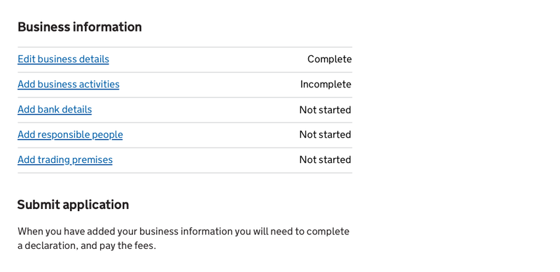
We had overwhelmingly positive results from usability testing with the text-only status tags. Users understood exactly what was required of them:
I can’t submit while things are ‘Incomplete’, everything would have to be completed
They also commented on the task list’s simplicity:
really straightforward
So, after several months of the pattern being used to good effect by our live users, we shared our work with HMRC’s Design System Working Group.
The Working Group reviewed our user research findings, as well as the other data we were able to gather to prove no users had any issues. They voted and agreed the pattern is:
- Usable
- Consistent
- Versatile
So the pattern was added to the HMRC Design Patterns library and more services are now using it, gathering more user research, and when the pattern gathers enough weight it will be submitted for consideration in the central government Design System.