Even the finest of details can be important
Since my post on refining my brand, I’ve encountered a tiny issue that I wasn’t able to ignore.
With a circular crop, which is what services like Twitter do, the 8 × 8 grid the icon uses leaves the rectangular underscore too close to the edge of the circle. I mean, it looks fine, but it could be better.
The position on the x-axis is fine; it’s the height. It just needs lifting slightly. Lifting it a row on the 8 × 8 grid is too much – that brings the top of the rectangle onto the centre, which is too high. Half of that amount works really well, which is where a 16 × 16 grid comes in.
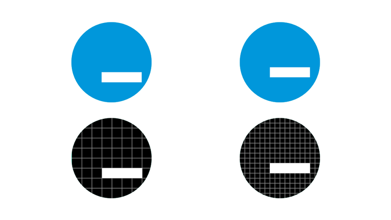
It’s worth mentioning that the 16 × 16 grid doesn’t quite work on a square or rounded square canvas, so I won’t be switching to the new grid completely. The 8 × 8 grid is perfect for those uses – super simple and nicely positioned/proportioned.
But where I know a service will display my icon on a circular canvas, I’ll be using that 16 × 16 grid in order to raise the underscore up a tiny amount. It’s a shame there isn’t a one-size-fits-all, but if a service that currently uses a square avatar switches to a round one (or vice versa), it’s not the end of the world – the icon still looks fine; just not perfect.
I can feel my team-mates’ eyes rolling whenever I pick out minutia like this on the Government services I work on, but I’ll happily continue to do so – attention to detail can have a big impact on the confidence users have in the products we ship.