Windows high contrast mode and focus outlines or: My focus indicators were inaccessible
First posted 22nd March 2023 in Accessibility, CSS and Development; updated 27th March 2023
I have an apology to make… In order to make my website’s keyboard focus outlines look nice in Safari, I inadvertently broke things for people who use Windows High Contrast Mode (WHCM) with the keyboard alone.
WHCM is a way to apply a high contrast theme to the whole operating system, including web content in your web browser. From Microsoft’s Fluent UI Web Components documentation:
High contrast mode uses the CSS media feature,
forced-colors. Whenforced-colorsis set toactive, the user agent will apply a limited color palette to the component.
The “limited color palette” is the key bit; not only does it use a very small colour palette, it simplifies what is styled. MDN Web Docs goes into more detail:
the following properties have special behavior in forced colors mode …
box-shadowis forced tonone
Removing all box shadows is no doubt to remove any soft edges that would reduce the contrast between an object and its background, which is a good idea. The problem is that if box-shadow is being used to style :focus (or, better, :focus-visible) ‘outlines’, they’ll be removed by WHCM, leaving keyboard-only users with no idea what element they’re currently focused on.
Safari causing problems
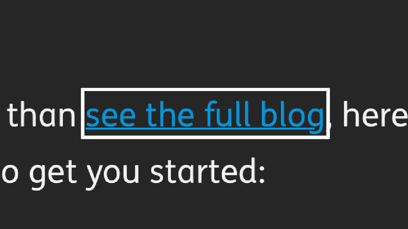
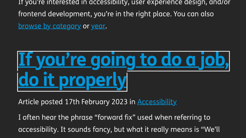
The focus outlines on my website are a thick black (in Light Mode) or white (in Dark Mode) line with rounded corners and (you guessed it!), to get Safari to look consistent with other browsers, I used box-shadow and set * {outline: none;}.
Safari’s outline styling has sharp-edged, which felt out of character on my website; there are weird diagonal hair-lines at each corner, like a picture frame:

And it looks a bit gnarly when a link wraps from one line to another:

I would almost certainly have used outline if:
- it had not been for Safari’s lack of support for rounded corners on
outlines - I had known that my workaround with
box-shadowwas problematic
I’ve written before about how inconsistent styling from browser to browser can end up causing serious accessibility issues, and this is another example of that. I dread to think how many people, like me, have used box-shadow for focus styling because of outline’s limitations in Safari, inadvertently leaving keyboard users in Windows High Contrast Mode with no idea what they’re currently focused on?
Safari fixing the problems
The great news is that Safari should soon use focus styling like the rest of the browser world, as the outline problem was fixed in Safari Technology Preview 157 last November:
Changed outline to follow border-radius
It looks like it’s coming in the next release, version 16.4, which is probably due out on the 28th of March 2023 (next week, at the time of writing).
Of course, that doesn’t mean all users will immediately have the nice rounded corners, but it’s only a matter of time as more and more people update their operating system and/or browser. And even then, because I’m using :focus-visible rather than :focus, the only group of people who will see the unrefined focus styling are:
- Safari users who haven’t updated to Safari 16.4
- Keyboard-only users (
:focus-visibledoesn’t show up on click/tap, like:focusdoes)
WHCM and focus-visible
One thing I did worry about was WHCM’s support for :focus-visible, rather than plain old :focus. Well, I’ve got more great news! After some testing, it looks like WHCM understands :focus-visible fine, so WHCM keyboard-only users get a perfectly accessible experience.
Short term ugly for the benefit of users
So my border-box to outline fix looks a bit ugly, but fewer and fewer people will see it as they upgrade to iOS/iPadOS 16.4 (no doubt only because of the new emoji), and see the notification in macOS that tells them that Safari is ready to update.
It’s looking like a matter of days away but, even if it were months or years, I’d rather my focus outlines were visible to everyone and slightly ugly looking for some, than pretty everywhere but for some people completely invisible.
Update
Since publishing this article, I’ve discovered a workaround (thanks to Matt Deeprose, and Darek Kay) which allows styling with border-box and using a transparent outline instead of removing it. If Safari 16.4 wasn’t so close I might use this, but I’m happier to have removed a few lines of code and not add any extra complexity, no matter how small, to my codebase.