Efficient, simple and usable GOV.UK dashboard pages
In the service I’ve worked on for the last two years, the team has made a lot of improvements. The central page where the user enters their business information was one big win, but another core page was also causing problems.
Once the user has filled in all of the details the service requires, they have wait for a decision; while they’re waiting, they can log back in to check progress, messages and make changes to their business information. The page they are presented with here is a dashboard overview of their registration.
There were many issues with the design of the dashboard I inherited, but I’ll focus on those that were fixed by reprioritisation of information, visual simplification and removing unnecessary elements, and bringing the design on-pattern.
Prioritisation of information
We observed essential content being missed time and time again in user testing, as the most important information was often towards the bottom of the page.
This was especially apparent when a user’s annual renewal was due – they would have to scroll down the page, likely past their screen’s ‘fold’, negotiating the rest of the content (and clutter!), before arriving at the button to start their renewal.
Interviews with the government caseworkers who dealt with our users confirmed that users were failing to renew, which was causing lots of unnecessary work, so fixing this was a priority for all involved.
We moved the most vital information to the very top of the page, following an inverted pyramid design, so the user would see that first.
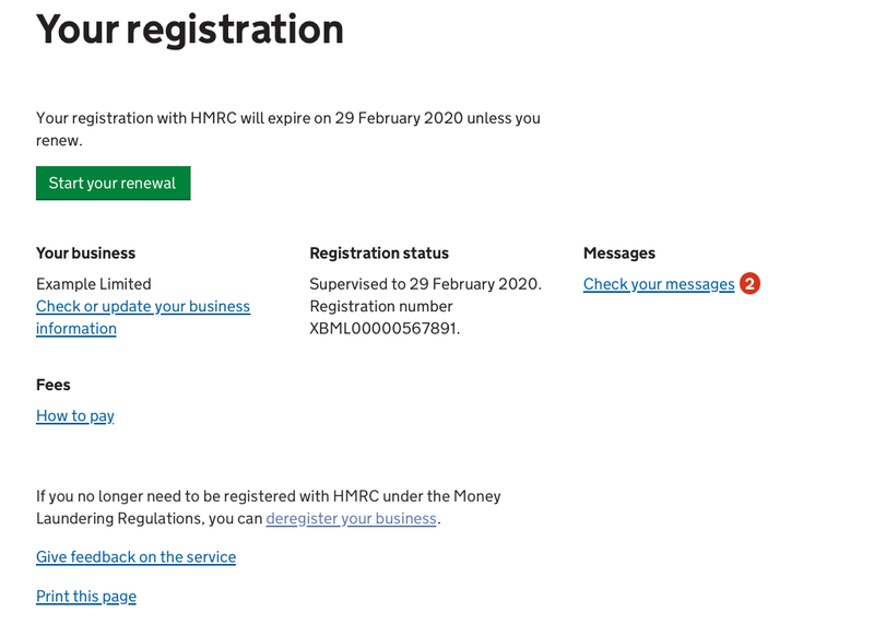
The remaining content on the page was sorted by priority:
- Business details
- Registration status and details
- Messages
- Fees
- Deregister
- Give feedback on the service
- Print the page
Simplifying the interface
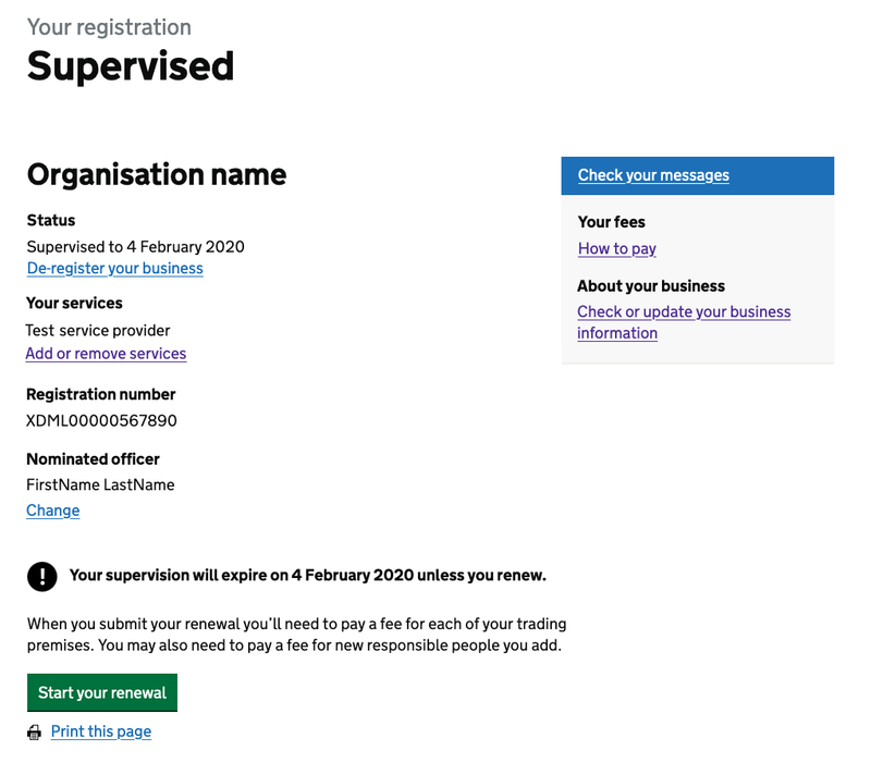
There was a lot going on on the original dashboard pages. Too much.
You might have spotted from those last screenshots that I consolidated some of the information, like the business name and link to change the business information, which were previously on opposite sides of the screen.
I’m a believer in presenting the right information at the right time, so I also removed a couple of unnecessary elements:
- The business’s services, and the link to make changes to them
- The business’s ‘nominated officer’ and the ‘change’ link
My hypothesis was that the user would know to do those things via the “Check or update your business information” link, and this was overwhelmingly confirmed with a series of first click tests, where 95% took the correct route.
I also removed a checkmark design for the application progress/status which not only failed WCAG 2.1 AA colour contrast, but contained confusing language, wasn’t clear what and didn’t provide any extra information that the page heading didn’t already.
Using established patterns
Simplification often means using a pattern that already exists, which is exactly what I did with the ‘Check your message’ link, which was proving hard for users to find. It was displayed as white text in a blue block and sat neatly on top of a very light grey box-out.
We found users thought it was a heading panel for the grey box, and didn’t read or click it. Its positioning was unfortunate too, as it was placed in just the spot where a user’s banner blindness would kick in.
So I fell back on an established and well tested pattern: the Notification badge, which presents the link as a link, but enhances it visually with a red marker with a white number if there are any unread messages.
This new, simplified style proved very successful in first click testing we carried out, with 92% of participants clicking in the right place. It’s still positioned over there on the right hand side, but now, without the separation caused by the two thirds followed by one third layout and the visual distinction it had previously, it feels very much part of the page.
One final reinforcement
With such positive one to one remote testing with many users and the great results from the first click tests, the updates were published. Since then, we’ve gathered some encouraging data from users:
- a reduced bounce rate (it almost halved!)
- less time spent on the page (more than a third less)
- zero support tickets asking where to find messages
- no support tickets suggesting any design decisions were wrong
I’m really happy with the work we’ve done on these dashboard pages.