Making a website accessible
Gusto Research are a client I’ve been working with since 2013, long before I was an accessibility specialist. I picked up the project as part of a complete redesign of their brand identity by Ant Barker, who brought me in as ‘the website guy’ as his skills lie in visual identity, print design, and marketing strategy.
The old site must have been a decade old by that point, and full of security issues, so it was a knock-it-down-and-start-again scenario; the result was a smart-looking, responsive website. Another decade passed and, although Gusto’s site had seen many updates over the years, the brand was beginning to feel like it needed freshening up.
Back in 2013 I had rebuilt the site with Perch and in the intervening years I refactored it using Eleventy and DecapCMS, so the platform was modern, secure, and well maintained. A good starting position.
With the technical side solid, attention turned to accessibility and user experience, and over the years I had built a long list of accessibility fixes I wanted to make. I had been chipping away at as I learned more about the specialism, picked up new performance techniques, and so on, but to do it properly required larger refactoring exercises, and some re-thinking of brand elements.
So when the time came for refresh, I pushed it as a great opportunity to clear the decks and get the site not just compliant with the Web Content Accessibility Guidelines (WCAG), but a good experience for all users.
A collaborative approach
I’ve been working with Ant for years (he even designed my logo). He is extremely talented at branding and visual design, and I’m excellent at user experience design and some of the more technical aspects of looking after clients and websites; we’re an excellent complement! Our process on this project was typical of many others:
- Ant puts together some website concepts
- We go through them together and I flag any usability and/or accessibility concerns
- Ant makes some tweaks and the client sees the work
- Once the client is happy I start building
Rewinding to step 2, in my feedback I usually cover things like:
- Colour contrast
- Headings, page hierarchy, and content grouping
- Navigation and paths through the website
- Avoiding patterns that may cause issues for some users
Here are a few examples of issues with this recent Gusto project and how we put them right.
Colour contrast
I advised Ant that the the primary blue colour in Gusto’s brand didn’t provide enough contrast against white to meet WCAG’s 1.4.3 Contrast (Minimum). At 2.93:1, it fell well short of the required 4.5:1 for regular text, and just shy of the 3:1 requirement for ‘large’ text.
This was a long-standing issue, but tweaking the blue would have meant other brand assets would have to follow. What better time than a brand refresh to make the change!
Ant was happy to darken the blue very slightly from #01a0e4 to #019ddf, which meant it would hit the mark when used in headings and other large text. We also removed any use of it for smaller UI (user interface) elements like buttons.
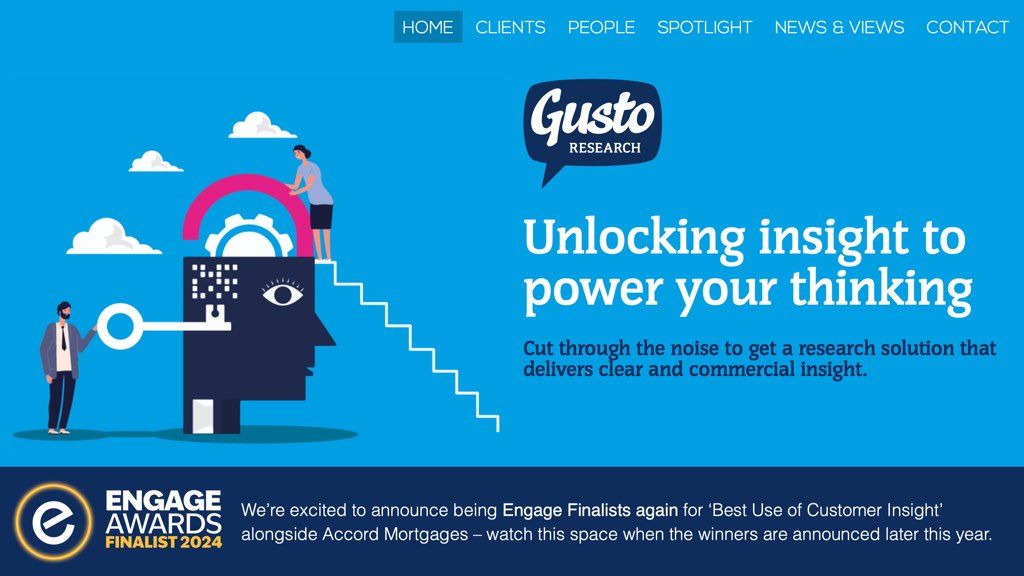
#01a0e4 with white, a 2.93:1 contrast ratio, which was just short of the 3:1 required for large text, but a long way off the 4.5:1 required for smaller text such as the navigation links.
#019ddf to provide a 3.04:1 contrast ratio, meaning large text met the required threshold. Smaller text uses a much darker colour, usually #0e2c5c.Filling a structural gap
The initial designs for the site structure were for the four Expertise pages:
- Brand Health & Communications Development
- Create Motivating Products & Services
- Enrich Customer & User Experience
- Understanding Your Audience
These were to be linked to from the homepage, but the client wasn’t keen on a dedicated ‘hub’ page as it felt like it would repeat the content already on the homepage.
I explained that it would be a good idea to add:
- for search engines, since some people may just be looking for ‘expertise’ and having a page to return for them would make sense
- to avoid a ‘page not found’ if anyone ‘hacks’ the URL, leaving just www.gustoresearch.com/expertise/
- so that each ‘sub’ page in the header and footer navigation didn’t look (long page names) and feel (structurally/hierarchically) messy
- to ensure consistency with other pages the have multiple sub-pages, for example the Team page
The client agreed, so Ant put together a mock-up for the new page and I brought it to life.
Heading/header markup
As I’d been chipping away at the code over the years, the HTML (and ARIA where needed) was in pretty good shape, but there’s always room for improvement.
One thing that had been bothering me was that each page’s <h1> was nested inside <header> element. This isn’t a massive deal from an accessibility point of view, but it’s something I wanted to put right.
The problem with refactoring the markup was that it would mean a great deal of the styling would break and require putting right. But since the CSS was getting some serious attention anyway, due to the rebranding and updated page layout, this was the right time to make screen reader users’ experience better.
A lot more besides!
The rebuild touched almost every part of the site, from refactoring templates and tightening semantics to updating focus styling and fully modernising the codebase. It laid the groundwork for a site that is more consistent, and easier to maintain.
What was delivered
The resulting site is visually refined, technically up to date, and fully accessible. The new colour palette meets contrast requirements, content is structured clearly, and navigation is consistent and predictable. The codebase is easier to maintain, and the experience works better for all visitors. You can read more in Gusto’s accessibility statement.
Ian Rowlands, the Managing Director at Gusto Research said:
We’re delighted with the new website. It reflects who we are as a business and, just as importantly, it’s now accessible to everyone who uses it. Martin and Ant worked together seamlessly; their combined expertise in design, usability, and development made the whole process smooth and enjoyable, and the result speaks for itself!
Having worked with Gusto for over a decade, this project summed up my approach to accessibility: steady, continuous improvement built on strong relationships and modern, maintainable foundations. Each refresh has been a step forward, bringing everything together into a cohesive, sustainable whole.