Mobile friendly markers
Posted 6th April 2015 in Accessibility and Search
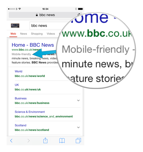
You might have noticed that if you search for something on Google on your phone there’s a new ‘Mobile friendly’ label.
No? Don’t worry, it’s quite subtle. Open your phone’s web browser and search Google for something. If the website is mobile friendly it’ll have a wee ‘Mobile-friendly’ marker before the page description.
Why is this important?
This is a big deal. Google are doing something they don’t often do: giving us a clue as to what they view as important on a website.
The marker isn’t in your face, but it takes up room on Google’s results page. Room that might otherwise be used for adverts or providing other details about a website.
Webmaster blog post
As well as including a marker on mobile friendly websites, Google also wrote a blog post on their Webmaster Central Blog detailing how their search algorithm is being adapted to account for mobile usage.
Mobile-friendly test
Google have also launched a web page where you can test if a site is mobile friendly or not. Another indication that they’re keen for websites to cater for smaller screen sizes.
How will it affect my ranking?
If your website is mobile friendly you’ll see a “significant impact” in Google’s search results, according to their blog post. Whether this is only on searches made from a mobile device or from any size of device isn’t clear, but seeing an improvement in your site’s search engine ranking in any context is a good thing.
Knock-on effects
If your site looks good on mobile devices, it’s because it has been designed to do so. As far as I know, this is the first time that Google have revealed that they are able to ‘view’ the design of your site.
Previously search engines were only able to read the content of your site and how it was ‘marked up’, as well as measure how quickly it downloaded.
The fact that Google’s search-bots are now able to detect how your site looks opens a whole can of worms. If they aren’t already, they soon be able to check for other, more visual accessibility concerns (yep, I count having a mobile friendly website as a visual accessibility issue). Here’s a quick list to give you an idea of what Google might be measuring your website for:
- Contrast: is the text legible against its background?
- Text size: is the text large enough to be read easily?
- Clutter: is their enough space between content?
- Distraction: repetitive animations or too much visual ‘noise’ can cause visitors problems
- Colour choices: are there colours on your website that mean colour blind visitors will have trouble viewing your content?
What next?
Have you already got a mobile friendly website? If you’re not sure, just run your website through the testing tool. If it passes, congratulations – enjoy the boost in your search engine ranking! If not, talk to your web designer about how you can get your website displaying nicely on smaller mobile screens as well as larger laptop/desktop screens.
My mantra still holds true. In fact, more-so than ever! If you write, design and build your website for human beings, your search engine rank will take care of itself.