How my website’s design has evolved
Yesterday’s post on Why I haven’t ‘redesigned my portfolio’ since 2014 got me thinking. How has my website evolved? I did some digging on the Internet Archive WayBack Machine (and filled in one or two gaps where images were missing) and the results are quite interesting.
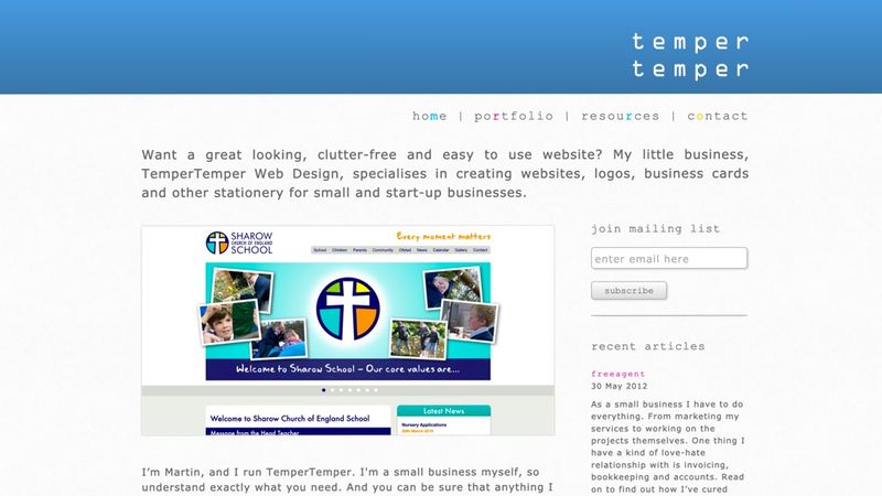
May 2012
By May 2012, after more than a year of trading, my business establishing nicely. I was starting to win freelance work with local agencies to supplement the then-core business of designing, building and maintaining small business’s websites. The design was very 2012, with plenty of heavy gradients and drop shadows, and a few accessibility no-nos (like no clear <h1>) sprinkled in for good measure. But at that point I was so busy with client work that my website had to take a bit of a backseat.
January 2014
By 2014, my brand and the website’s design had been pretty solid for a number of years, using OCR-A for the logo and Museo Sans for all other typography, #4485c7 as the brand colour, and the gradients and shadows had all been stripped away in line with the ‘flat design’ trends of the day.
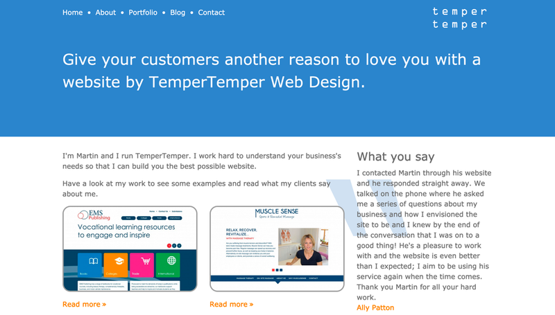
December 2014
Following a rebrand in the summer of 2014, the site’s design took a marked turn to the minimal, with a ‘hamburger’ navigation menu (don’t judge me – we all make mistakes!) and big, bold headings in the new brand font, FS-Me.
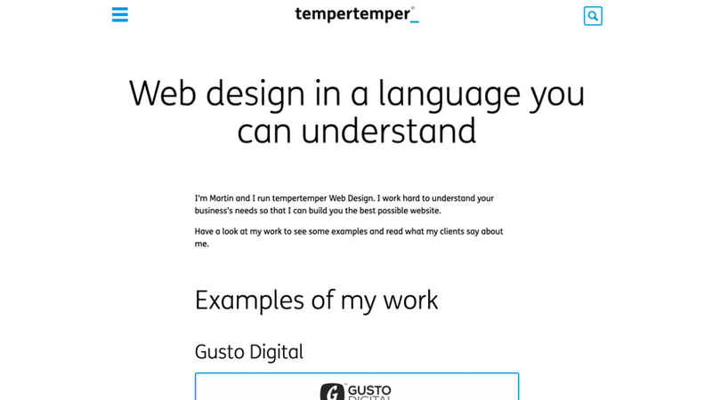
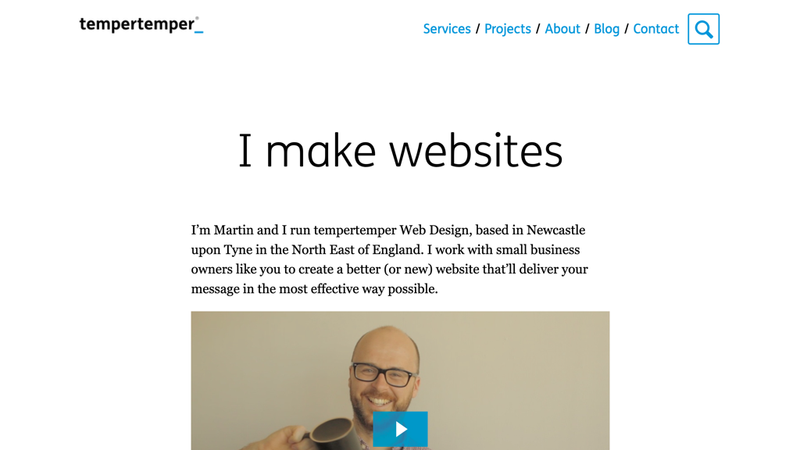
June 2018
A snapshot of the site from June 2018, just before I completely rebuilt the it, shows that I abandoned the misguided hamburger menu, and added a video to introduce myself to my potential clients. But otherwise little had changed in nearly four years.
Note: Although I completely rebuilt my website, it doesn’t count as a redesign – I changed very little HTML and CSS.
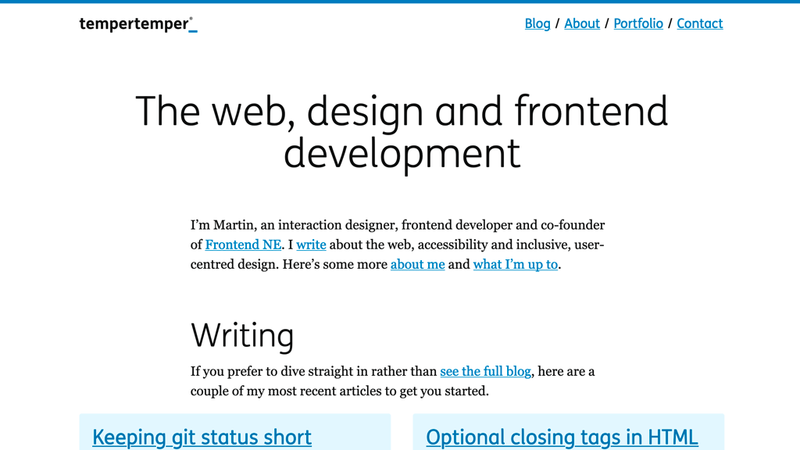
June 2020
Since then, I’ve changed the focus of my website completely. I’m no longer pitching myself to potential clients, whether website owners or larger companies in need of a product designer or frontend developer; rather, it’s essentially a blog, where I write articles that are (hopefully!) useful to my peers.
The design has only changed subtly in the two years since the last snapshot, with darker blues for better colour contrast, and a slightly smaller headline font size.