Making a Government service accessible
In March 2018 I began work as the interaction designer on a government service that was in pretty bad shape. It was a couple of years old by that point and it hadn’t had the care and attention it needed, which was causing problems. That in itself would have been challenge enough, but it was also one of the largest services in HMRC.
It contained were design patterns that were out of date, new best practices having been introduced more recently, and its sheer size had meant it contained custom designs to cater for user needs that nothing in the design system had up to that point catered for.
Fast forward to the summer of 2019 and the delivery of the digital service was in sight. This meant a ‘Live services’ team would pick up the ‘finished’ product, maintain the codebase and design patterns, and ensure it continued to meet the demands of its users. As it was by that point a legal requirement for Government services to meet WCAG 2.1 AA international accessibility standard. So as part of the process of assessment, every service must be rigorously tested for accessibility by an external body, the Digital Accessibility Centre (DAC).
I had been working with the development team on the frontend implementation of various designs, but the general accessibility of the service needed some serious attention if it was going to meet those AA standards.
Major redesigns
I’ve already written about how I tackled the usability and accessibility of two core parts of the service, the dashboard and the task list. The dashboard is seen by every user when they log in, and the task list forms the ‘hub’ of the service, where the user adds and updates their business information. But there was an awful lot of work to do elsewhere.
Question pages
The first bit of work was the biggest as our service contained around 300 questions. The job was to:
- audit all of these questions to ascertain common patterns
- create a template for each of those patterns
- ensure each template followed GDS best practice recommendations
- ensure each template was accessible to WCAG AA
The GOV.UK recommendation where questions are being asked, is to ensure only one thing being asked per page, so the <h1> is usually the question. In order for the form under the heading to be accessible to screen readers, the content of the <h1> was repeated in the form’s <legend> or <label>, but visually hidden. This meant that screen reader users heard the content twice, so a new pattern had been introduced where the <h1> was placed in the form’s <legend>, or the <label> inside the <h1> (depending on whether the form contained a <fieldset> or not). This recommendation made no visual difference but was much less repetitive for screen readers, so we changed every template to follow this.
Pairing
I worked very closely with one of the developers who had the most interest in learning frontend development, and together we created templates for:
- straightforward text inputs
<textareas>s<fieldset>s, like checkboxes and radios- date
<fieldset>s, which consisted of 3 inputs (day, month, year) - anything that didn’t fit, such as email
<fieldset>s with two inputs: “Email” and “Confirm email”
Team workshops
The amount of work we carried out and the various whiteboard scribblings piqued the interest of the wider development team (including the testers), so I led a series of HTML workshops to teach them about form inputs and, in particular, <fieldset>s, both how the code worked and what to expect in manual testing using a screen reader. And it wasn’t just the developers that attended – the content designer, user researcher; even the project owner and scrum master came along!
One thing per page
I’ve mentioned the ‘one thing per page’ best practice, and this was another long running set of changes the team made. There were lots of pages that didn’t follow this guidance and there were sometimes 3 or 4 things being asked on a single page, each being progressively revealed when a particular option on the preceding question was chosen.
For example, if a user was asked what their favourite colour was, the form might look like this:
<form>
    <fieldset>
        <legend>What is your favourite colour?</legend>
        <label for="red">Red</label>
        <input id="red" type="text" />
        <label for="blue">Blue</label>
        <input id="blue" type="text" />
        <fieldset>
            <legend>Do you prefer light blue or dark blue?</legend>
            <label for="lightBlue">Light blue</label>
            <input id="lightBlue" type="text" />
            <label for="darkBlue">Dark blue</label>
            <input id="darkBlue" type="text" />
        </fieldset>
        <label for="green">Green</label>
        <input id="green" type="text" />
    </fieldset>
    <input type="submit" value="Submit" />
</form>
The one thing per page rule means that:
- Users aren’t overwhelmed with information
- Information is easier to digest on smaller screens
- Error messages were much less complicated
- Check answers pages were much less complicated
Not only that, but some pages posed an accessibility problem where a <fieldset> is being used within another <fieldset>. Leonie Watson details the problem in her article Using the fieldset and legend elements:
It is possible to nest one
<fieldset>element inside another, but it is not recommended. Screen readers do not automatically indicate the end of the<fieldset>element, so it is impossible for screen reader users to confidently know which fields belong within which fieldset.
Splitting the offending pages out into multiple, more digestible pages took the most part of a year, with one or two now-infamous ‘page splits’ per sprint, but the service is now in great shape.
Colour contrast and focus styling
In July 2019, GDS updated the colour scheme to provide more accessible colour contrast. I worked with the dev team to update their SCSS stylesheets to incorporate the new colour palette.
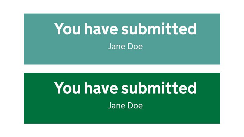
Updating to the new colour palette wasn’t a colour contrast panacea, though. We had an issue during some in-person user research with a user who had very low vision. They couldn’t read the supporting text in our confirmation page as it followed an out of date pattern, with white text on a light teal (#519f97) background. That combination scrapes through WCAG AA colour contrast for large text, but fails for smaller text. Updating the panel’s background colour to dark green (#00703c) meant we passed AA for large and small text, and even hit AAA for large text.
What isn’t documented in that GOV.UK blog post is the focus styling. With the focus highlight colour being lightened from orange #ffbf47 to yellow #ffdd00, there wasn’t enough contrast with the white page background, so those with visual issues or even just dodgy old monitors might not see the yellow highlight against the white page background the styling was updated to include a heavy underline as well as the yellow background colour when a link is focussed. I worked with several members of the frontend dev community in Government to ensure we were implementing the new focus styles correctly, since they weren’t documented.
Problematic number input types
Another in-person user research session, this time with a Dragon user, highlighted a serious issue with number inputs. The user was unable to answer the question they were being asked; it turns out type="number" is almost completely unusable with Dragon.
The fix was to replace type="number" with type="text" and progressively enhance the <input> with a combination of inputmode="numeric" and pattern="[0-9]*", to ensure the appropriate software keyboard was displayed on touch devices. Coincidentally, GDS published a blog post around the same time we were working on this, which goes into great detail on the problems type="number" causes and why their (and our!) solution is the right one.
Broken and invalid code
One job I carried out was to run tests on the whole site to ensure all of the code was valid. Spoiler alert: it wasn’t!
The service was littered with messy HTML, which was:
- partly because it often wasn’t templated (templating keeps your mistakes in one place, rather than scattering them through a website)
- a result of the developers who had worked and were working on the service not being familiar with the often very strict rules that apply when writing HTML
So the good news was that it was easy to fix all these problems – when something’s very obviously a mistake, you don’t need to do much digging. Ensuring the fix doesn’t cause any styling to break and carrying out some cross-browser testing is all that’s necessary to ensure there are no regressions.
Broken references
An example of a broken reference we found was where a form’s <label> wasn’t hooked up to its <input>:
<form>
    <label>What is your name</label>
    <input id="name" type="text" />
    <input type="submit" value="Submit" />
</form>
This meant that clicking the label didn’t put focus on the <input>, and screen reader users would have no idea what the input was after. The simple fix here was to add a for="" attribute to the label, with the value of its input’s id:
<form>
    <label for="name">What is your name</label>
    <input id="name" type="text" />
    <input type="submit" value="Submit" />
</form>
I also found some missing aria-describedby="" attributes, which were preventing form hint text being read out by screen readers when the user tabbed to the input:
<form>
    <label for="name">What is your name</label>
    <p id="hint">Enter your full name</p>
    <input id="name" type="text" />
    <input type="submit" value="Submit" />
</form>
The fix here was simply to add the aria-describedby="" attribute to the <input>:
<form>
    <label for="name">What is your name</label>
    <p id="hint">Enter your full name</p>
    <input id="name" type="text" aria-describedby="hint" />
    <input type="submit" value="Submit" />
</form>
Invalid code
Here’s an abbreviated example of some code that was causing issues:
<ul>
    <details>
        <summary>Learn more about something</summary>
        Blah blah blah…
    </details>
</ul>
The only direct child element allowed in a <ul> is an <li> (well, <script> and <template> are also allowed, but let’s not go there). The <ul> was serving no purpose here, so simply removing it as the parent fixed the issue:
<details>
    <summary>Learn more about something</summary>
    Blah blah blah…
</details>
Mobbing
The way I tacked these issues was to lead some mobbing sessions with the dev team and testers. We all sat round a big screen and worked our way through the list of issues I’d put together; as we did so, I’d highlight were the code was erroneous, explain how and why it was causing problems, then guided them through the fix and how to test it.
The developers learned a great deal about writing HTML as well as screen reader behaviour, and I tried to keep the sessions lighthearted and fun, so we had some laughs along the way.
Links that look like buttons
There were several places in our service where links were styled as buttons. For example, we had pages at the start of each section of the service, telling the user what information they would be required to gather. They had ‘Continue’ buttons at the bottom, which were in fact links styled to look like buttons.
The reason they were styled like this was:
- to provide a clear route to proceed to the next page
- to be consistent with the rest of the pages in the section, which had actual buttons
<a href="/service-name/section-name/page-name" class="button" role="button">Link text</a>The links were fine from a semantic point of view as their implicit role had been overridden with role="button", but we needed to do some more to properly mimic the behaviour of buttons, as opposed to links.
Adding the draggable="false" attribute ensured they weren’t able to be dragged into the browser’s tab bar to open the link in the background, as normal links are.
<a href="/service-name/section-name/page-name" class="button" role="button" draggable="false">Link text</a>There was a further issue here as the links that looked like buttons weren’t pressable with the spacebar, which instead caused the page to scroll. In order to fully mimic the behaviour of buttons, these links needed a snippet of JavaScript, which I detail in my article When design breaks semantics.
Updating dependencies
Some GOV.UK dependencies were out of date; notably the autocomplete our service was using for country pickers in addresses.
We were seeing issues with screen readers where, for example, the aria-expanded="false" attribute wasn’t on the input, meaning the user had no idea that there was going to be some content popping up (or ‘expanding’).
There were one or two other issues, but updating to the most up to date autocomplete fixed them.
Training, coaching and a successful assessment
The result of nearly a year’s hard work by the whole team meant that we successfully passed our DAC assessment, and went on to pass our GDS assessment without any recommendations, a feat that few services in the department achieve; most being handed over to Live Services with at least some issues still in the product backlog.
Not only did I lead the way to getting the service accessible, but I trained the team up as I went. We’ve now moved on to a new service and we all have a deep appreciation for the importance of baking accessibility into design and development work right from the start.