Pixels, constraints, minimalism, and tempertemper
My high school ‘work experience’ placement was in an IT department of a large organisation. I spent the first week driving from office to office fixing hardware; it was fine, but not really my thing. The second week, however, was a different story – I was tasked with drawing icons for their in-house software application. Nobody in the office seemed to have wanted to do this, so it was pushed my way with no small amount of relief.
For a week, I happily churned out icon after icon, thinking about what the best way to represent each part of the interface was and working with their drawing tool. This was around 1993, so the icons weren’t the crisp vectors we’re used to today – it was all about clever use of pixels, working within the very tight grid with a limited colour palette.
Pixels
I’ve always loved pixels. I grew up playing a Nintendo Game Boy and my wee brother’s Nintendo Entertainment System (NES), and, at the time of my work experience, the Super NES would have been brand new.
The graphical constraints presented by an 8 or 16 bit machine were pretty hefty but to my eyes it all looked (and still looks!) amazing.
I would spend many an evening locked in my bedroom, designing my own games, thinking through story, character development, gameplay, controls, and visuals; drawing out the sprites on graph paper.
So it’s safe to say I have a lot of nostalgia wrapped up in pixels, and am a big fan of pixel art.
Minimalism
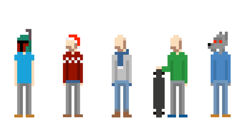
Fast-forward a decade or so to the early 2000s, I was working in a call centre when a spreadsheet containing a quiz was being circulated. These kinds of things did the rounds every so often to relieve the tedium, but this one really grabbed my attention. It involved tiny, pixellated drawings of famous bands and musicians which, after some investigation, turned out to be ‘Minipops’, taken from a website called Flip flop flyin’.
I was playing in a band at the time and thought it would be cool to draw the three of us in the same format, and the tiny version of me is the avatar I use on Twitter, all my Slack teams, and most other places on the web.
You probably know I’m a bit of a minimalist, and I love the idea of boiling something down to as low a fidelity as possible while keeping the essence of the original. So every now and again I update my Twitter avatar with something seasonal: a Star Wars outfit on May the 4th or some kind of scary costume at Halloween.
A better fit
You’ve probably seen that I’ve tweaked my brand recently:
It [the underscore] now has square corners, making it a perfect rectangle and well and truly checking the ‘simplicity’ box
One of the reasons I’m so happy with the brand tweak is that the underscore now provides a ‘bridge’ to those pixel-art style social media avatars and the pixellated Christmas cards I’ve sent to my clients over the years.
The pixels were always a bit random – something I liked that didn’t really fit with my brand. But now that the underscore is a 1:4 rectangle, rather than a rounded underscore taken from the FS-Me font I use for the logotype, it makes a bit more sense if I use squares and rectangles and pixels elsewhere!